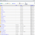
Responsive Administration
This album shows TWG in the responsive mode. This means that the structure of the images and on the detail page the images and videos itself does scale to the browser size. On this overview page the images do float. Please resize the browser to see the effect.
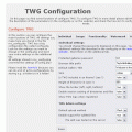
On mobile devices you don't need to scroll to the left and right anymore. Please read howto 57 about the possilbe settings. This mode is not standard because you have to consider a few points explained in the howto. The empty folders are only here as examples to show the floting effect better.


